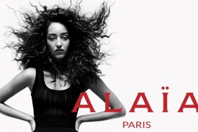
Honeycombchild called the images a “waste of some of the collection’s beautiful colors,” and HeatherAnne agreed. “Absolutely, more than almost any other brand I associate them with color… Meghan looks pretty damn cool, I love her moodiness,” she shared.
“Much as I don’t rate Meghan’s look at all, for these ads and for this vibe, I have to concede that she’s definitely right for this,” Northern Star posted.

Psylocke referred to Meghan as “the perfect choice for this collection and campaign. I like those shots a lot,” she added. “I agree that it would have been nice to see this in color but I appreciate the mood that’s created with the black-and-white; its gloominess complements the heavy and boxy garments in this collection nicely.”
For me, the black-and-white photography brings an Alexander Wang type of feel to the campaign and the clothes. The brands court the same cool girl customers, but I want Proenza Schouler to look more like Proenza Schouler. The designers’ individuality and creativity usually sets them apart, but if you take away the logo, these could almost be ads for any downtown New York brand.
Images: proenzaschouler.com

