IMAGE CREDIT: FACEBOOK.COM/VOGUEPARIS
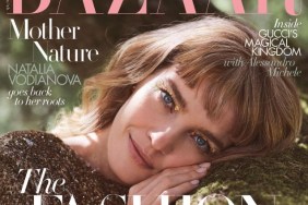
The thread has garnered mix reviews. “I would have never thought about Natalia and I’m disappointed. The cover is too simple even if she’s beautiful. I would have loved a fresh face like Joan or Karlie. It’s like they didn’t want to take risks. September 2014 is really disappointing imo,” commented an unsatisfied Oxymore.
“I hate this, she looks like she’s got a mustache and her look ain’t happier either. The styling is beyond boring, for a September issue…” posted Royal-Galliano.
A better solution was offered by littlekiki: “I feel like any other model in the same styling would have been more intriguing. Is Natalia becoming boring? I think so.”
“What an ugly cover. The styling is terrible, there is too much Photoshop and absolutely nothing stands out…” posted Thefrenchy, yet another disinterested forum member.
There are a few members who appreciate the magazine’s efforts, however. “Even though it is the twin ed of Vogue Russia’s September issue from 2010 (I guess?!) I love the cover! The contrast and saturation makes Natalia look a little rough, but as a whole looks good, and I love the detail of the unzipping of the LV dress, gorgeous!!!!” complimented miguelalmeida.
The cover is growing on Nepenthes: “The more I look at it the more I like it. I did expect Karlie but at the same time Natalia looks gorgeous. Two major September covers already!”
Are you a fan or do you dislike the fact that Mert & Marcus used the same concept over again? Read some more comments and post your own here.