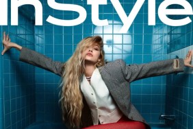
IMAGE CREDIT: INSTYLE.COM
However, the Shake It Off singer could be wearing a potato sack and it wouldn’t stop us from taking notice of the overhauled masthead. “What did they do to the masthead?!?!” asks A.D.C.
Due to the design difference, [J.]Oliver wondered if the cover was for subscribers and wrote, “Is that the Sub cover?! It’s.. messy.”
“Total chaos,” disapproved jal718, suggesting the revamp hasn’t done the magazine any favors whatsoever.
MON shares everyone’s sentiments: “Firstly, I hate how they removed the box from the logo. This looks like a cheap version of Glamour.“
“I hate the new masthead!! It looks very basic, and the text seems somewhat more than usual. I like the actual shot of Taylor, but I’ve seen this LV look quite enough. Besides, this is the second LV cover (first one was Sept.), same season, same collection?? Overkill.” rants an underwhelmed Benn98.
Srdjan questions, “I wonder about the masthead, will they completely remove the sash (which is sort of a trademark for InStyle) or is it like this only this month?”
The makeover certainly isn’t going down well and GlamorousBoy hopes the international editions don’t copy the design: “Oh no, I believe this is not their new masthead because it looks absolutely disgusting and cheap… hope this wont be redesigned worldwide.”
“Yikes! I didn’t even think about this, this change will probably take effect across the board,” replies Benn98.
Magazines should be keeping us on our toes, right? Do you like the change, or hope it goes back to normal next month? See inside the thread for Taylor’s cover story and join the discussion here.