IMAGE: FASHIONGONEROGUE.COM
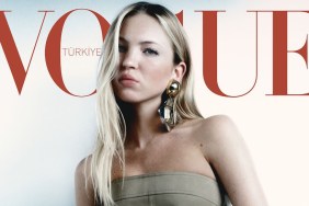
As always, the real question is: Are our forum members impressed? Not particularly. “I implore Vogue Turkey to hire a new art director. What is a rather serviceable cover image is monumentally let down by the layout/text. Vogue Turkey had the strongest art direction when it first launched — what happened?” asked AL92.
MON was also full of advice and commentary: “Whoever thought that this is a Vogue-worthy layout needs to be fired ASAP. How many fonts must one use to put emphasis on the taglines? Isn’t there a reason why bold, italic and underline were invented… At the rate they are going, Vogue Turkey makes the layout of Vogue Taiwan look rich. At least they focus on 1 font. Vogue Turkey used to slay other Vogue editions with their layout but now, they’ve fallen out of the competition. Not even worthy of being considered.”
“It looks like the cover of a cheesy 70s porno,” declared GivenchyHomme. Ouch!
In agreement was fluxxx, who posted, “It looks pretty porn-ish and the position of the tube top is really awkward.”
“Vogue Turkey started off so promising and now this is what we get. And yes, it does look rather porn-ish, but not the good kind,” responded justaguy.
Wowza. See more of the discussion and add your own two cents here.