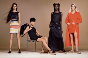
IMAGE: STYLE.COM
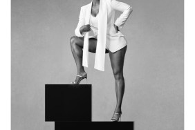
It was only natural for our forum members to share their views with us. “Very interesting concept, Joan is gorgeous. I really like the first picture,” admired elle_gb.
“I really like this. Nice to see Joan not blasted with Photoshop as well, she doesn’t need it,” iclawhands appreciated.
Nepenthes had a positive attitude toward the campaign, too: “Absolutely stunning! There is nothing about this that I don’t love!”
Also sharing the same sentiments about the post-production was GivenchyHomme, who credited, “It’s nice to see her looking more natural here as opposed to her usual Photoshopped self.”
But not everyone was feeling the campaign. “I hate how the light hits her face. She already has a rough face and the light just highlights it,” slammed anlabe32.
Benn98 appeared to agree. “I also think her face looks quite rough in the blurry shots. The b&w ones are OK, but nothing special. They didn’t even bother with her hair.”
“10 seasons of you hating <<< 10 seasons of Joan WINNING,” fired back valliaddict.
Does Prabal Gurung’s spring campaign deserve a round of applause or a thumbs down? Let us know here.