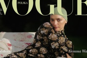
IMAGE: VOGUE.COM
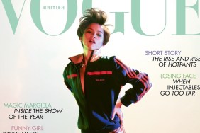
“Yikes, couldn’t they have put something more interesting/flattering/fashionable on her? Very bad cover, depressing colors,” commented Nymphaea immediately.
“For me this is one of their WORST covers!! I mean what on earth is she wearing, and on what planet is a shift dress that cheap looking, fashionable?” Miss Dalloway asked.
Also feeling underwhelmed was fluxxx: “Even Lucky covers look better than this. This is depressing. It’s like a super bland ELLE cover. I would never have guessed that Annie shot this.”
Oxymore shared the same sentiments. “Maybe I would have liked it if she was smiling. I like the background and the pose but she seems sad,” she noted.
“I actually like it… She looks strong and dominant! She’s all business. Love the hair. There could’ve been a better shot but I’m okay with it. Not Vogue‘s best,” added MON as the tone steadily started to turn around.
“I’m glad she got the cover. I think she looks good. I don’t expect much from Vogue honestly. But like someone mentioned, her skin isn’t lightened and her hair isn’t straightened and she looks like herself. I appreciate that,” nataliaapple admired.
Love it or loathe it? Take a peek at what Vogue‘s April issue has to offer and join the discussion here.