IMAGES: STYLE.COM
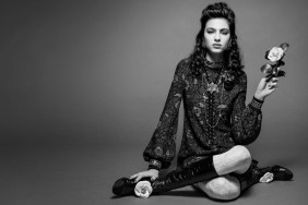
Something was seriously bugging our forum members. “That damned text…just the logo would have sufficed. Happy to see Amber though,” shared anlabe32 right away.
“This won’t sell. She looks like a skinny dude. It might be confusing for people. BTW that logo is amateurish,” DutchHomme added.
In agreement was thatsfierce, who exclaimed, “I’m happy for Amber, but this is crap. The logo [is] still ruining everything. Change it, please.”
Forum member narcyza was left underwhelmed, too, ranting, “She’s scary! And this blue text doesn’t help. I was thinking it will be a much better campaign, especially with Amber.”
“Ew. This looks more like a magazine cover than a campaign and Amber doesn’t look too good here either,” Nomar complained.
Benn98 couldn’t wait to express his disbelief. “Gross. I’m mad about Amber, but her expression is awful. That’s just the tip of the iceberg, this campaign is quite vile. She looks like a man,” he pointed out.
“Amber just doesn’t have the right attitude for this kind of styling. She just can’t express that ‘cool’ vibe,” thought congacon.
Are you a fan of the direction? Drop us a comment here.