IMAGES: DIGITAL EDITION OF US HARPER’S BAZAAR
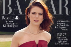
“Eek, it’s certainly interesting. I just don’t know whether a silhouette like this works well for a cover,” thought Benn98 the moment the subs cover surfaced.
“That is the ugliest, cheapest and most amateur looking cover I think I’ve ever seen,” MyNameIs slammed soon after.
Also not feeling any of Bazaar’s best efforts was Oxymore, laughing, “OMG Photoshop disaster!”
Forum member dfl-001 agreed: “She’s not photogenic so that may explain the darkened silhouette.” Ouch! Later going on to suggest, “If you have to completely rearrange someone’s face with that atrocious Photoshop, maybe it’s time to throw in the towel.”
Nymphaea was quick to throw some shade too. “That’s horribly done!” she shared in horror.
“You’re so right, it’s really unfortunate. What’s happening with her teeth? It looks weird!” Benn98 responded in agreement, returning to the thread to take a closer peek.
“The cover is grotesque! It’s absolutely vile! She really does look like an alien in disguise. What were they thinking?” asked GivenchyHomme.
Like it or loathe it? Check out some previews of Bazaar‘s October 2015 issue and join the conversation here.