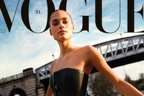
IMAGE: VOGUE.NL
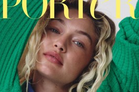
Has Dutch Vogue done Gigi a disservice? Apparently so. “Crikey, the text overload paired with the messy styling and hair isn’t a good sight. I feel like they’ve toned the different fonts down over the past few months, but now they’re back to their old tricks,” shared a dismayed Benn98.
“This is really bad and she’s giving us her best blank face,” contributed KateTheGreatest.
Sharing the same underwhelming sentiments was SpeakThatJDunn: “Absolute mess. She looks like she stumbled in drunk, fell on the floor, and they snapped a quick pic on her way back up.”
Yet things started to look up as Miss Dalloway confessed, “This shouldn’t work, but it totally does for me and I like it!”
“Surprisingly I like this. Maybe it’s the styling plus the hair which are doing her favors. She doesn’t look as bad as she usually does on print, we’ve honestly seen worse from her,” reasoned a pleasantly surprised khyrk.
RanThe agreed, commenting, “I really like this! Gigi has always been my favorite out of the so called ‘it’ girls! The expression is little blank, but it works!”
Check out some previews of Gigi’s cover story and drop us a comment here.