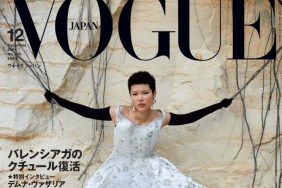
IMAGE: VOGUE.CO.UK
Our forums didn’t hold back the criticism, however. “Love the colors and her pose but what is up with the fake lens flare? Photoshop 101?” asked a dismayed WilliamsLe010919.
“The pose is very awkward. The lens flare effect is shameful,” agreed arlekindearabal.
“I was so happy when I saw the title, but the outcome is disappointing. I hate both the styling and the pose. The colour scheme is new for U.K. Vogue, but it’s so kitschy. Maybe I’ll like the tactile version…” said Srdjan.
Certainly not feeling the cover was jeffandtheworld: “Ugly color scheme. This looks like a free magazine. Unbelievably cheap.”
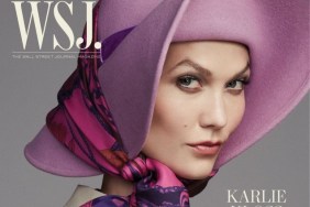
Forum member dodencebt wrote, “They’ve managed to turn Karlie into a less-than-ordinary girl you’d get for an amateur shoot. Congratulations.”
MyNameIs wasn’t exactly jumping for joy, either, declaring, “Cheap and tacky is right. That shade of green in the background is the worst. You can do festive without it being so over the top and amateur.”
“So 70s style and bland. What a boring cover for closing the year,” exclaimed burbuja8910.
Do you agree that the cover could have been a whole lot better? They did have Karlie, after all. Share your opinion with us here.


