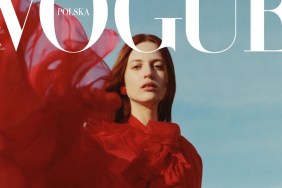
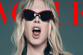
“Not the best pic of Cate. I don’t like her makeup, also the outfit isn’t doing anything for me. She looks better on red carpet pics. I miss the glamour,” shared a dismayed Nymphaea within seconds of the cover dropping.
[ See: The Year in Photoshop Fails ]
“I don’t like the cover. With Cate as a cover star and Davidson as the photographer, something much better could have been produced. This just seems lazy and uninspired,” echoed a disappointed KateTheGreatest.
Also not feeling it was t-rex, questioning, “I think they digitally elongated her neck.”
“Super boring. It almost looks like they shot this in a studio and then just added the background later,” declared orchidee, obviously suspicious of Photoshop, too.
Forum member ellastica soon shed some light on the cover, writing, “Aside from the garish, belted dress and artificial, overexposed studio lighting just on Cate’s face, that’s actually a beautiful cover. That black masthead is very striking and ties in nicely with the dress ruffles/detailing. Plus the cover lines are thoughtfully spaced out and italicized.”
“She’s just flawless. You can put her in a potato-sack and she will look like a million bucks,” raved gazebo, clearly an admirer of the cover.
In agreement was Nepenthes, complimenting, “Beautiful cover shot, always love Cate!”
Are you a fan of Vogue Australia’s December cover? Drop us a comment here.

