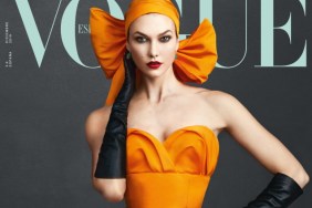
IMAGE: DESIGNSCENE.NET
Unfortunately, the cover failed to leave our forum members in a celebratory mood. “I don’t like this, so many wrong things IMO: her face, the layout, the catalogue vibe…” complained kokobombon immediately.
“Horrible cover, it’s getting worse than U.K. Vogue,” added a horrified burbuja8910.
Forum member tigerrouge shared the same disappointing sentiments, echoing, “I certainly don’t mind a cheesy theme for December, but at least make her look fantastic. Karlie’s a great model, but when it comes to a cover, I’d rather see a shot of her face at a good angle, rather than this – or what we got on U.K. Vogue.”
Also unsatisfied with the outcome was dcmaike: “It really looks like a cheap catalogue with clothes copied from Chanel.”
“Too much Photoshop, the expression on her face and the pose are too much,” stated justaguy.
Sensing some airbrushing had occurred, marsnoop2 asked, “Why is her face so Photoshopped? The second cover is lovely though.”
“I like it. It’s a commercial type cover done well. I think some people always want some avant-garde type sh*t on every cover and don’t consider the marketplace or demographics…” shared A.D.C., shedding light on the cover.
IMAGE: DESIGNSCENE.NET
Too cheesy for your tastes? Drop us a comment here.