IMAGE: WWD.COM
Members of our forums were not impressed. “What a lovely American Vogue editorial! Oh wait,” laughed MON the moment the campaign dropped.
“So I know Lily’s not a good model by any means, but I’m going to blame Photoshop for destroying her smile here,” pointed out marsnoop2.
Also noticing signs of a post-production blunder was Nymphaea, questioning, “Cute, but Lily seems to look at some other interesting thing in the distance than the guy, maybe a merge of two pics?”
Kite agreed: “150% shot in a studio and superimposed. I mean the lighting on Lily Aldridge is so far away from natural it’s almost otherworldly.”
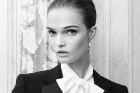
Soon after, discussion started to target the models themselves. “Yikes, first time I see Romee Strijd’s face in clarity! Who discovered her? She’s really no oil painting. The clothes looks amazing though. Pity about the casting,” shared Benn98.
“Well, Romee is one of the prettiest models out there but Testino is able to make everyone look ugly,” anlabe32 later replied.
“That up close shot of Lily is horrifying, not her best angle. This is bad work,” expressed a horrified VersaceVixen009.
Eek! Check out more images from the Spring 2016 campaign and voice your own opinion here.


