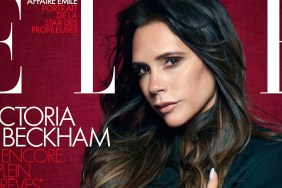
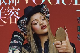
Members of our forums couldn’t hide their dismay for very long. “Yet another supplement-looking cover. You had Victoria and this is what you produce? And let’s not even begin with that horrendous font they’re now using. I miss the OLD Vogue China where the covers had high energy and were 100% sultry,” reminisced an underwhelmed MON.
“They had the right elements, a great photographer, a great beauty and they come up with this! I can’t deal with this, the type is just so awkward alongside Victoria and the layout — don’t get me started on that,” commented a frustrated WeberFanatic.
In agreement was KateTheGreatest: “She looks so awkward on the cover, with her head so forward. It’s like she has no clue what she’s doing and just trying different things but is still unsure of what it’s going to look like. I’m not a fan of all that white either.”
Bertrando3 wasn’t much of a fan either, voicing, “This layout is bad, the image is boring, too much white space, the font does not work. It’s all wrong!”
“There’s more space on that cover than between Georgia May Jagger’s front teeth,” pointed out A.D.C., also unwilling to accept the stark layout.
Are you a fan of Victoria’s new Vogue cover? Add your own two cents here.