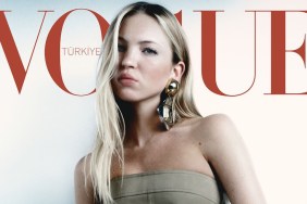
IMAGE: VOGUE.DE
It seems as though German Vogue‘s never-ending love for cover lines remains. “Too many headlines. I’m choking,” cried out phungnam96 the moment the cover dropped.
“I absolutely love the image but so many useless tags, why?!” asked a disapproving kokobombon.
“Insane text layout, but still a fresh, and lovely cover. Love Edita, and it’s nice to see Boo getting more cover work!” applauded Miss Dalloway.
In the same frame of mind was MON, adding, “This is so much better than her Vogue Spain cover. This is stunning. It has a Peter Lindbergh feel to it. Let’s talk about that layout. My goodness. Vogue Germany seriously needs to update their layout and font. Everything about it feels so dated.”
“Not a massive fan, but it’s better than her Vogue Spain cover,” pointed out sixtdaily in agreement.
Benn98 was unwilling to overlook the bad art direction, too. “No, this doesn’t appeal to me. Looks very tacky indeed. It’s the greasy looking hair and smudged makeup. It seems each month this magazine tries to defile their images with as much cover lines possible. It’s embarrassing,” he slammed.
“It’s summery, but I can also imagine Pamela Anderson in that picture, clutching those ‘lace curtains’ around herself before they come off in subsequent shots. It’s cluttered and tacky,” said tigerrouge.
Are you a fan of Edita’s newest Vogue cover? Share your own sentiments with us here.