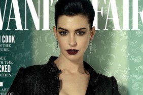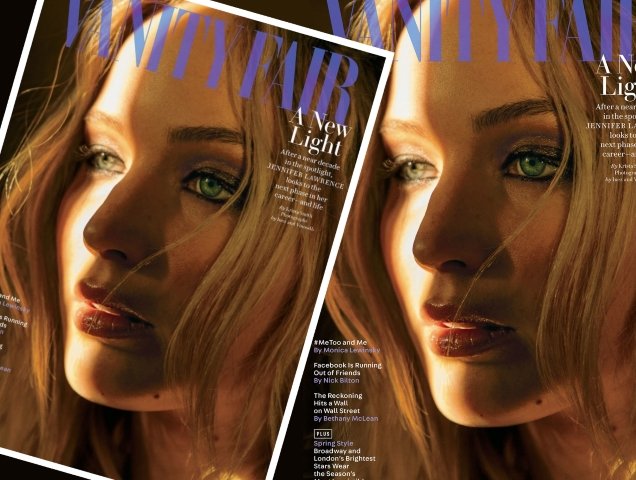
We were pretty much done with our copies of Vanity Fair’s annual ‘Hollywood Issue‘ the moment it dropped, due to the atrocious post-production work that included additional limbs and Nicole Kidman morphing into Naomi Watts. Graydon Carter, unfortunately, left on a real low and it seems as though the magazine’s newly installed editor-in-chief, Radhika Jones, is off to a rocky start. Overhauling the magazine (as you do for your first issue), Jones makes the conventional choice of Jennifer Lawrence as VF‘s March 2018 cover subject (a firm Carter favorite), who was shot by Inez van Lamsweerde & Vinoodh Matadin.
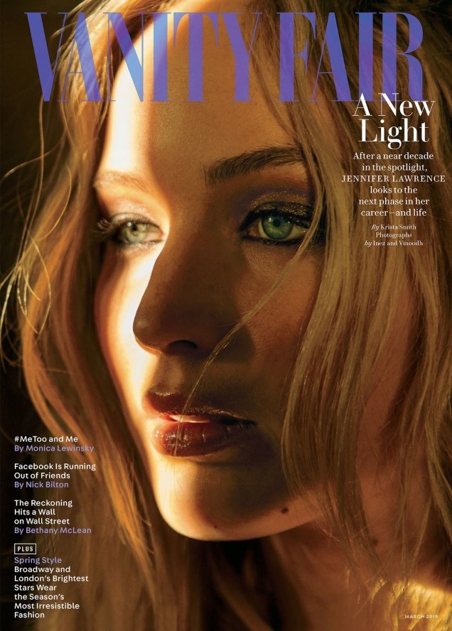
Unfortunately, our forum members weren’t too impressed. “Beautiful portrait of her face, and stunning light play, but another case of shrunken masthead! Why? It looks weird! I don’t get this sudden demise of art direction in magazines,” fumed Miss Dalloway the second the cover came to light.
“I don’t like this ONE BIT,” added Khabeer.
“A new light? I think they should use the old one! I don’t like the lighting, it makes her face look wonky. It also looks like she has a lazy eye,” GivenchyHomme pointed out.
[ Not a tFS forum member yet? Click here to join! ]
SallyAlbright won’t be in a rush to the newsstand, either. “Cool enough cover, but I am so sick of Jennifer Lawrence. I feel like there is nothing I don’t know about her at this point. Hoping she takes some time off after this latest film comes out because at some point I enjoyed her acting.”
“I actually love the cover but it’s embarrassing that it is so similar to The Hollywood Reporter‘s. Part of the editor’s job (and their team) is to be up to date with other publications. And the draft of the cover having the same font? Was someone trying to set this woman up?” asked forum member dodencebt.
Not everyone was disappointed, however. “I’m totally in love. Everything is so good, love the masthead and the fonts. Looks modern,” approved caioherrero.
“Oh, I am digging this. It somehow feels both thoroughly modern, while at the same time making me feel some sense of nostalgia for stars of old,” happycanadian chimed in.
Await the content of the issue and join the conversation here.