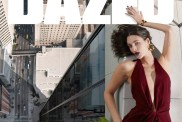
Pantone wants to bring calm to your stressful everyday life. That’s the thinking behind the 10 colors the organization chose for the Fall 2016 season, a muted bunch that falls right in line with the soft pastel hues they chose for Spring. “With all the angst that’s out there in the ether and in the world around us, there is a need for more calming colors,” Leatrice Eiseman, executive director of the Pantone Color Institute, told WWD, naming “modern-day stresses” like “living tethered to smartphones, financial uncertainty and job insecurity.”

Nicole Miller sketch Fall 2016; image: Pantone
The 10 calming colors that topped Pantone’s Fall 2016 list? Riverside Blue, Airy Blue, Sharkskin Gray, Aurora Red, Warm Taupe, Dusty Cedar, Lush Meadow Green, Spicy Mustard, Potter’s Clay and Bodacious. Many of these hues have already enjoyed a pop culture co-sign. Karl Lagerfeld incorporated Airy Blue into the Chanel collection he showed in Paris, Zayn Malik and Dascha Polanco rocked Sharkskin Gray hair, Aurora Red showed up on Rihanna’s Anti album cover and First Lady Michelle Obama wore a variation of Spicy Mustard to her husband’s last State of the Union Address.
Pantone’s hoping the new colors will help increase consumer spending. “A lot of people have gotten into the habit of not spending and there is a comfort level in seeking out what’s familiar,” Eiseman told WWD. “If people get in the habit of doing the same old, same old, you have to give them something interesting and reason to change.”
[via WWD]