IMAGE: WWD.COM
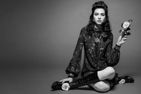
Are forum members wild about Natasha’s fierce warrior? “Beautiful but it’s like a Vogue Paris editorial with David Sims,” posted MON, setting the tone for the discussion.
“I see what you mean but it doesn’t bother me. The closeup looks gorgeous but I can’t stand the logo across her face,” responded Nepenthes in agreement.
Also citing the logo was TheoG: “Natasha makes it exciting, wish the logo wasn’t slapped across her face.”
“Wtf? This is so not Isabel Marant to me. Hate the pose, hate the logo over her face. Odd,” echoed gossiping.
“It’s very Sims and very editorial. Seems like still life is the thing of the season. Still, it’s an improvement for sure but I would have liked to see someone else,” added anlabe32.
“Isabel Marant is a very consistent brand. Her castings are always very exclusive and she always gets the big girls! I can see the Vogue Paris influences in this. I kinda like it even if it’s not very memorable.” noted Lola701, changing the mood of the thread, but failing to change the opinion of most of our forum members.
Check out Isabel Marant’s full Spring 2015 advertising campaign inside the thread and join the discussion here.