IMAGE: STOREMAGS.COM
Forum members couldn’t wait to express their opinions. “Beautiful! He’s beautiful. The picture is so gaudy and glitzy just like the house he designs for. I really like this,” approved Khabeer.
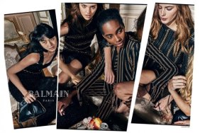
“I’m so happy for the success and fame Olivier is attracting to himself and the Balmain brand. There must [have] been an enormous amount of pressure and high expectations for him to do well. Especially for the first man of mixed-raced (man of color) of such a prestigious brand such as Balmain,” added fashionlover2001.
Also an admirer was arlekindearabal: “Oh, he certainly has the face for a Pierre et Gilles homage. He’s so pretty.”
TeeVanity was full of appreciation, too. “This is incredible, lovely cover. Out magazine’s having great covers lately, wonderful Olivier is a part of that,” he noted.
Although, not everyone was buying it. “I hate the frame overdose. It’s such an eyesore. I know it was used to make the cover look rich and regal, but it ended up looking tacky. It’s like he’s in a high end circus. I also hate how they seemed to have played with the lights to contour and highlight parts of his face but the end result just made the cover look dark,” MON immediately disapproved.
“Oh God, I really loathe this age of the ‘star designer’. This guy is becoming as frequently photographed and insufferable as his BFF Kim K. Of course the cover is excessively tacky – all that gold?” Benn98 questioned.
Are you a fan? Join the discussion here.