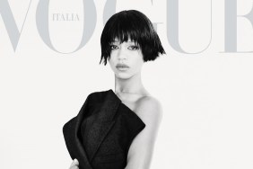
IMAGE: MARK E
Per usual, our feisty forum members weren’t afraid to voice their concerns. “That weave looks awful. Why are they so obsessed with pink text? Change it up once in a while,” HodanChloe ranted immediately.
“They could’ve done better with Emilia as the cover girl. Vogue U.K. covers are so repetitive,” agreed simon.
“She looks like she just woke up from a very wild night, hungover! The dress was last night’s serving and that wig started to lose all its glue. They should have at least placed the masthead behind her to show her off more, to make up for that awful expression. It seems like they tried to hide her,” added MON, not showing much enthusiasm, either.
Miss Dalloway shared the same sentiments, too. “Whoa, this is actually shocking to me. Let’s get a super beautiful photogenic girl, and do NOTHING with her, just make her hair look even more fried up, and tell her to exude no energy or life!”
Also unwilling to show support was narcyza: “It looks like a student took this photo. Awful cover. Emilia doesn’t look okay here, especially styled that way.”
“This cover is boring, can’t believe that Roversi shot it,” echoed burbuja8910. Oh, dear.
Check out a review for Vogue‘s May issue and join the conversation here.