IMAGE: KROQJOCK @ TFS
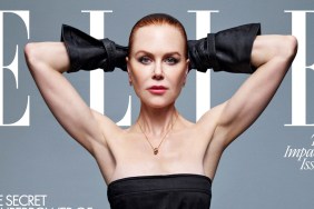
“I have such a soft spot for Nicole, it’s a great cover shot. The angle is perfect!” raved Miss Dalloway, getting us off on a high note.
“It’s classic Nicole and I love it! Much better than her recent ELLE cover,” [Piece Of Me] added in agreement.
Yet the cover failed to impress everyone else. “God this magazine is boring! Yes, Nicole looks nice, but the pose is imperfect. I can’t stand their fonts, Marie Claire is more exciting,” Srdjan discredited.
JennaaMonroe wasn’t projecting much love, either, writing, “Yawn, boring. It has a lovely feel to it but it’s quite bland and I feel like I’ve seen it a thousand times.”
“Always lovely to see Nicole, but the cover isn’t exciting at all, again the usual stuff,” echoed Nymphaea.
Bertrando3 was quick to point out some flaws, too. “This is VERY boring indeed. She looks sad and tired and the cover reads ‘happier than ever’ — good one! The pose is the same as Sandra Bullock indeed and wearing the same brand…” he ranted.
Does Nicole’s cover make you want to rush out and purchase a copy? Join our discussion here.