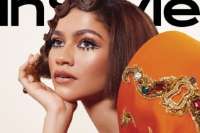
IMAGE: INSTYLE.COM
Members of our forums went off on the cover. “I’m really not liking the new cover formatting for U.S. InStyle,” criticized Handbag Queen right away.
“No, I’m not liking it either. I can see they’re experimenting with a cleaner look, but by tinkering with the design, it’s like they’ve lost the substance of their brand. They haven’t refined their identity, they’ve subtracted from it,” tigerrouge inputted.
Feeling the same way was MON: “It really saddens me to see an established magazine suffering from identity crisis. They’ve done well with their old layout, so why fix something that’s not broken? The new layout is just sad. The goal is to make the magazine look fresh, but it ended up looking tired, even more dated, and pretentious. It’s like how Glamour used to look like!”
Forum member jal718 agreed, simply adding, “No, not good at all.”
“The colours just remind me of a Diet Coke can. But maybe that’s just me,” mocked honeycombchild.
“Kind of baffled they went with a mostly white background when her hair, skin, and outfit are so light already. The gradient effect looks a bit stupid as well. Love Gwen, so I might pick this up regardless,” shared KINGofVERSAILLES.
Will you be buying it? Drop us a comment here.