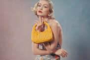
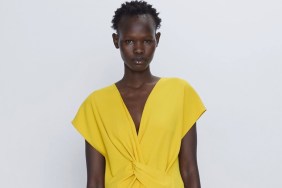
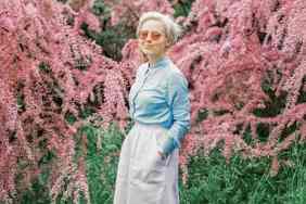
According to Pantone Color Institute executive director Leatrice Eiseman, the hues for spring are to keep us all a little more relaxed in the face of our busy, modern chaotic lifestyle. “The fact that technology has gotten so overwhelming and so 24/7 has really created a great part of the need for these comforting, softer colors. Technology plays a huge part in people feeling like they want to stop the world and get off,” she tells WWD. On tap, there is Rose Quartz, Peach Echo, Serenity, Snorkel Blue, Buttercup, Limpet Shell, Lilac Gray, Fiesta, Iced Coffee and Green Flash.
Rose Quartz was the color most used by designers, a soft baby pink that gives us chiller vibes just looking at it.
