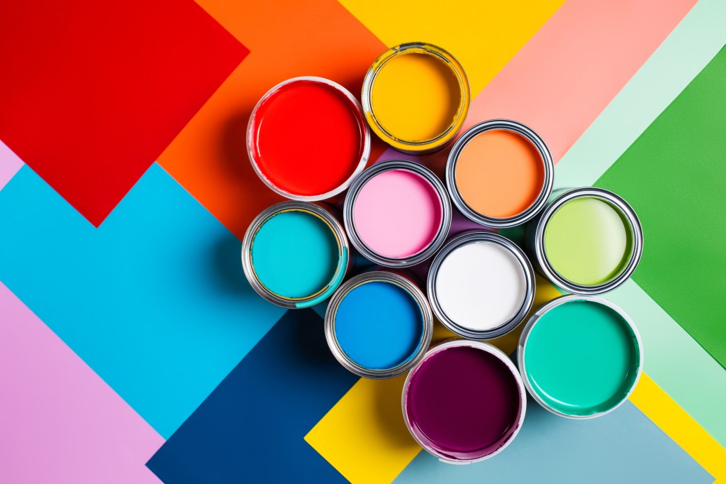
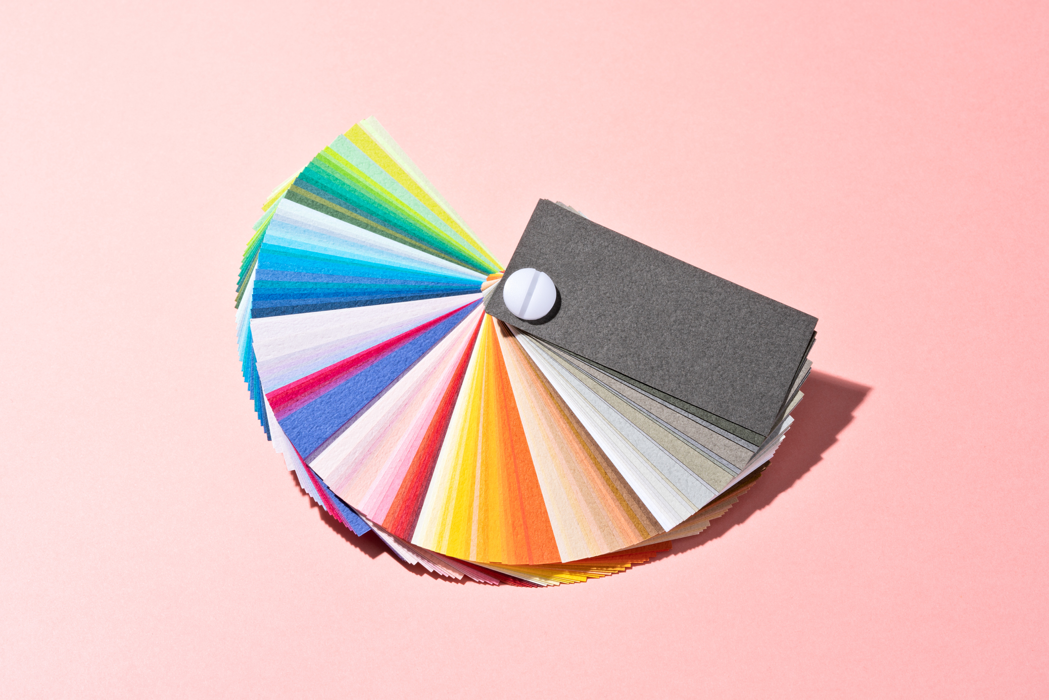
When picking a color for anything – whether it be an outfit or a wall – taste often is front and center in the design-making process. On a more macro level, however, colors are associated with very specific moods irrespective of personal taste.
With that in mind, we turned to Philippa Radon, C2 Paint Color and Design Specialist, and ask her to share with us how some popular colors can impact mood.
Reddish Browns (like Raku #549 – a rich, earthy red)
Mood: passion, strength
“Unlike traditional reds, an edgy, rusty seductive color that falls into the carmine palette introduces what some would describe as a deep earthy umbered oxblood with a red base that’s easy to live with. It works its way boldly into a modern space as a single block color– suggestively sexy with black; brazen with a blue; or as a rich dark, and dramatic color when paired with a pale, pink-leaning neutral. The richness of these tones hit the notes of color confidence and sophisticated drama.”
Off-White (like En Pointe #851 – a graceful near white)
Mood: a new start, simplicity
“A graceful shade of near white, is ambiguous and fluid, effortlessly adapting to its environment. Warm, calming, and timeless, its color is reminiscent of raw lamb’s wool or pale pebble stone – with a hint of tint, it makes a perfect choice for traditional or contemporary spaces and is a beautiful choice for a wall and ceiling overall wrap of color.
Most of us find that any soft pale white allows room to breathe and a sense of internal peace as soft pale neutrals flow effortlessly with the mind and spirit.”
Light Browns (like In the Bag #840 – a gentle approach to brown)
Mood: comfort, security
“If you are looking for a gentler design aesthetic that feels more in tune with natural materials but still embraces a sense of depth and connection to the earth, look for shades of brown like In the Bag. Warm, mid-tone neutrals remain in sync with many of the most popular sustainable elements and contribute to a more monochromatic schematic assembled through mixed mediums –like paint, wood, and metal– that work handsomely, particularly with mid-century style interpretations.”
Light Blues (like Thermal #752 – a refreshing light blue)
Mood: tranquil, peaceful, calming
“Cool, calm, and sophisticated hues of tranquil blue deliver an airy, soothing veil of color that delights the eye. An incredibly versatile tone, it can be used in a limitless number of spaces and material combinations like light bleached woods, softer brushed metals, and creamy warm stone, nubby textures as a way to elevate this to an even more ethereal palette. Or, take it up a notch and craft a bold color capsule that brings in some deeper mid-tone blues and a shot of an unexpected pink or green.”
Lavender/Lilac (like Bella Donna #782 – a modern neutral)
Mood: Freshness, renewal, romance
“Lavender and lilac hues have been simmering on the color front for some time now in both fashion and interior forecasts. These cooler colors carry a more sensory connection in the light spectrum, so they work exceptionally well as a counterbalance against warmer materials like mahogany, copper, brighter blues, and darker, more intensified versions that steer us into deeper violet tones. There are many opportunities for using lavender in traditional and modern spaces based on how playful or sophisticated you want to go.”
Dark Greens (like Foliage #661)
Mood: Connection to nature, reliability
“A verdant leafy green nods directly to Mother Nature. Earthy green tones create a tranquil yet enveloping environment and can be a game changer in any space. These tones can pair perfectly with some of the botanical wallpapers (hello, posh powder room!) and also look fantastic as an accent to raw materials like marble, stone, and tile.”


