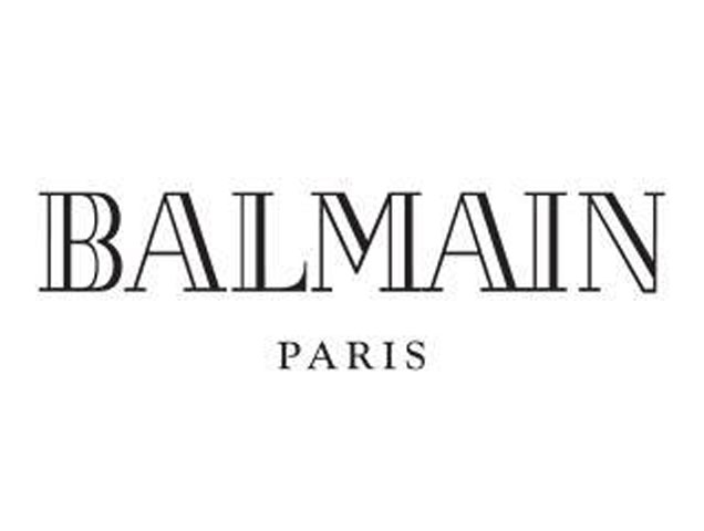
Luxury brand Balmain has had the same logo for nearly 70 years — but that’s all about to change. Creative director Olivier Rousteing has introduced a new, more modern version of the logo that trades the original serif style font for a simple sans serif font. Included in the logo is a circle surrounding a serif letter B and P to symbolize Paris (the brand’s headquarters) and Pierre Balmain (the brand’s founder).
“This new B, echoing some of Pierre Balmain’s mid-century monogram designs, works well for patterns and adornments for the house’s many collections,” says Rousteing, who already used the new logo for his Pre-Fall 2019 collection. “My team and I look forward to exploring new ways to incorporate it into future designs.”
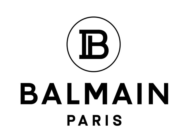
Following the Pre-Fall 2019 show, the brand’s social media pages were updated with the newest logo, which has received mixed reviews from followers. One user commented, “Why does the new logo look like it’s bitcoin?” Another user compared it to Chanel’s logo and some said it will be too easy to counterfeit.
Balmain isn’t the only brand to change its logo recently. This year, Celine’s Hedi Slimane got rid of the accent on the brand’s “é,” despite it being there for nearly 60 years. Both brands have gone for a more minimalist look, which begs the question: will it help strengthen the brands’ identity or hurt it?

[ Next: Raf Simons Just Redesigned the Calvin Klein Logo ]